INTHEWESHWIND_GUIDELINES_3 copy.jpg

In The Welsh Wind

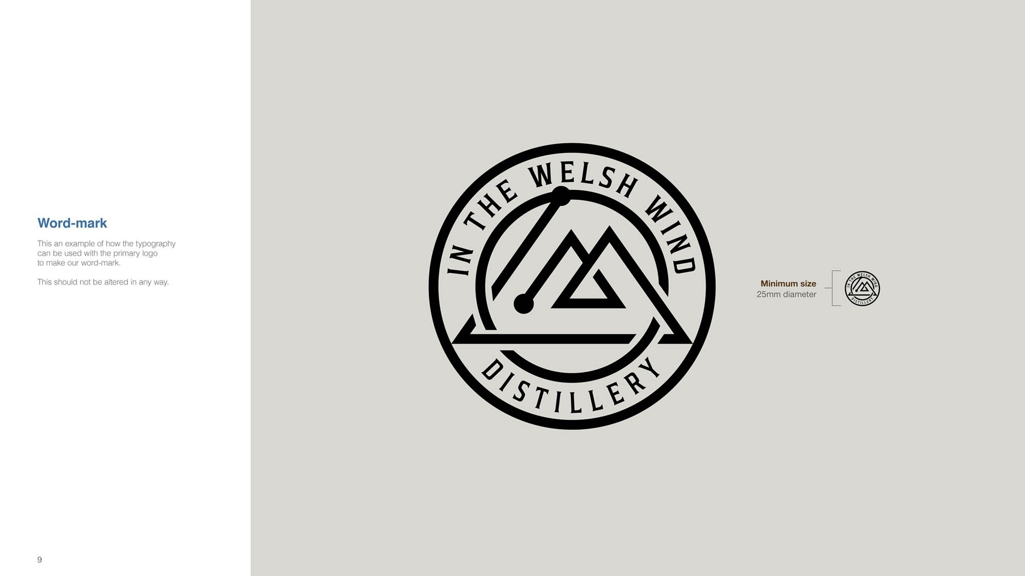
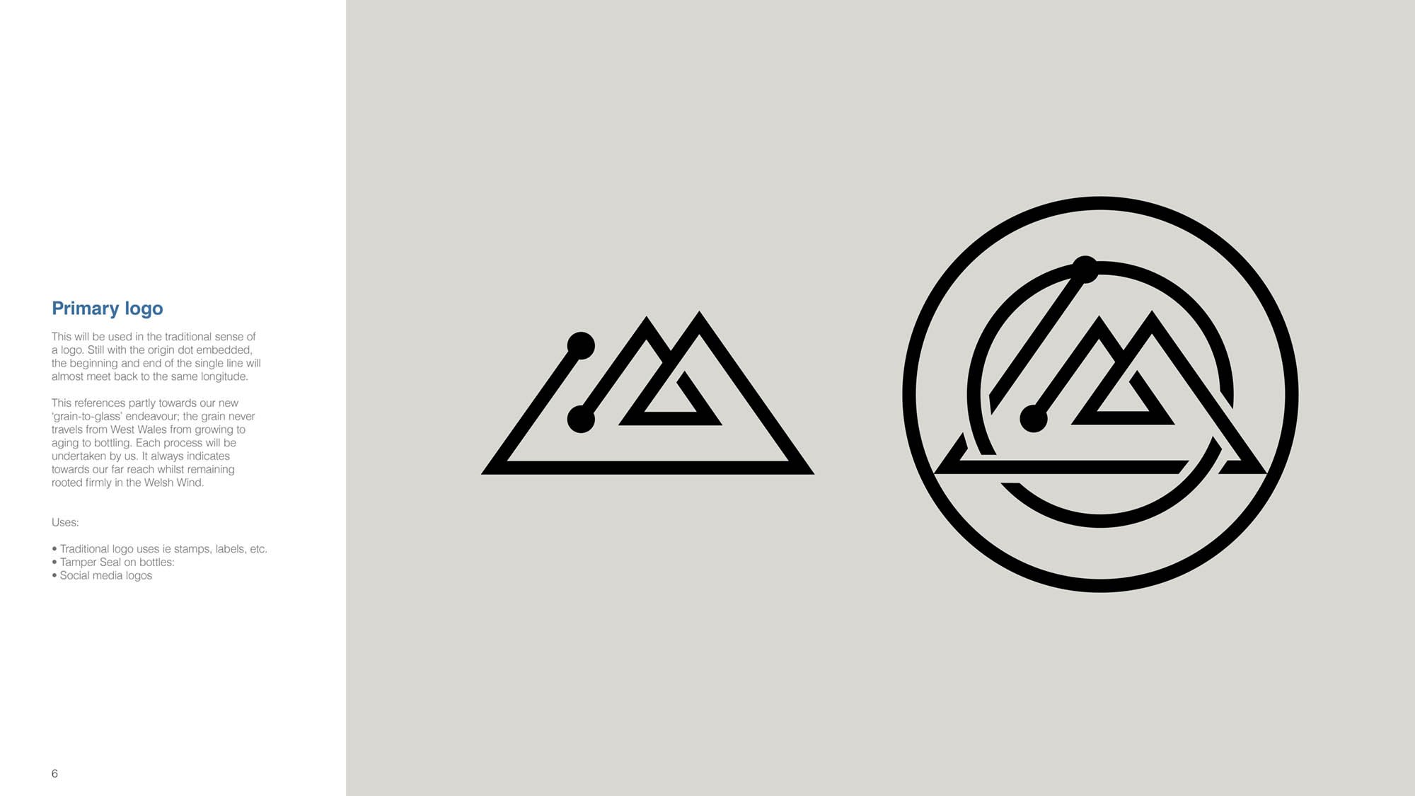
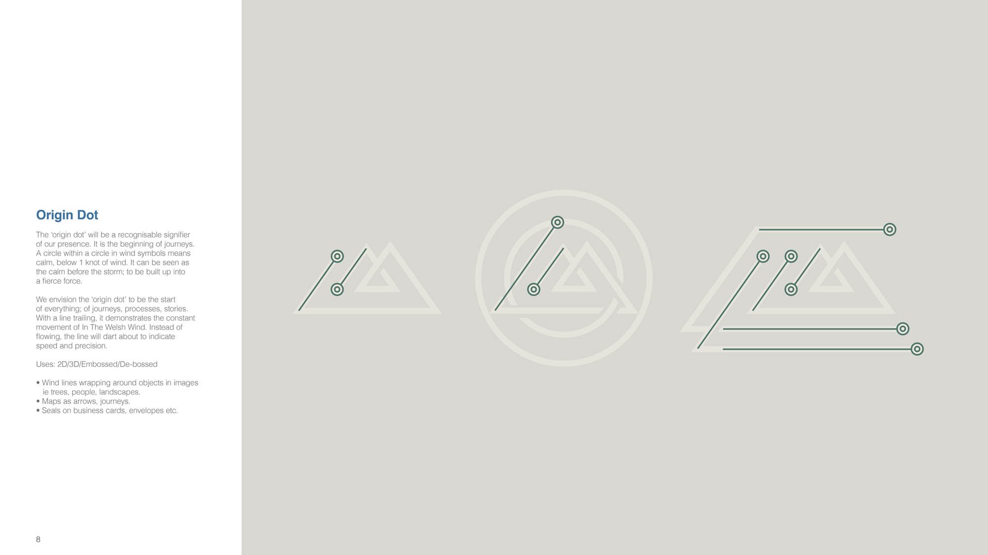
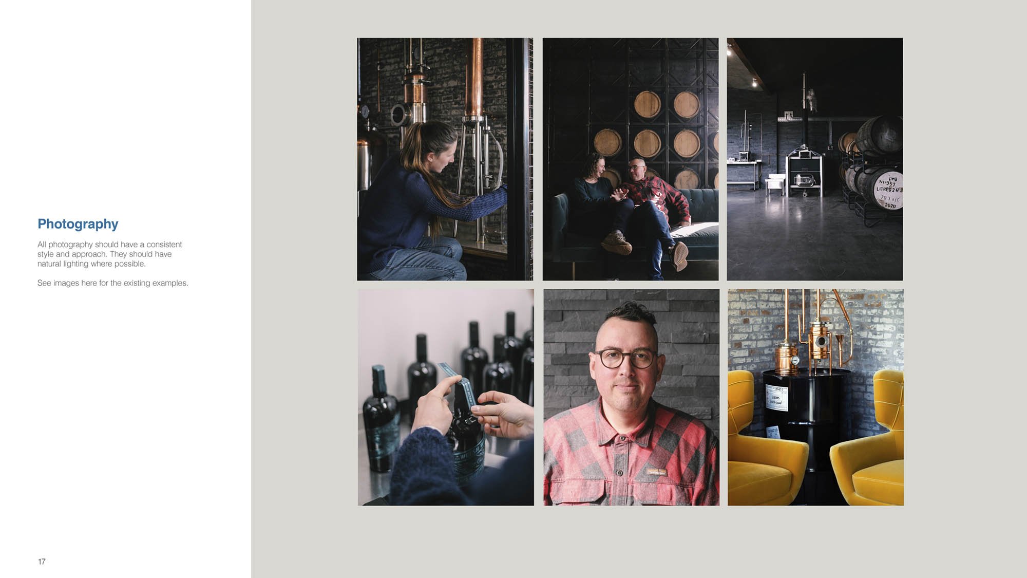
In The Welsh Wind specializes in crafting bespoke spirits using copper pot stills. They approached me with a vision for their new logo, inspired by the concept of an ‘origin dot’—a symbol of the beginning of a journey. This idea is represented by a circle within a circle, which in wind symbols indicates calmness, with wind speeds below 1 knot.

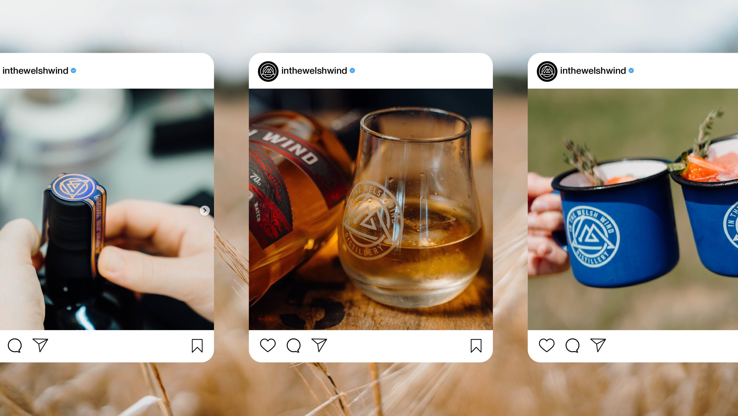
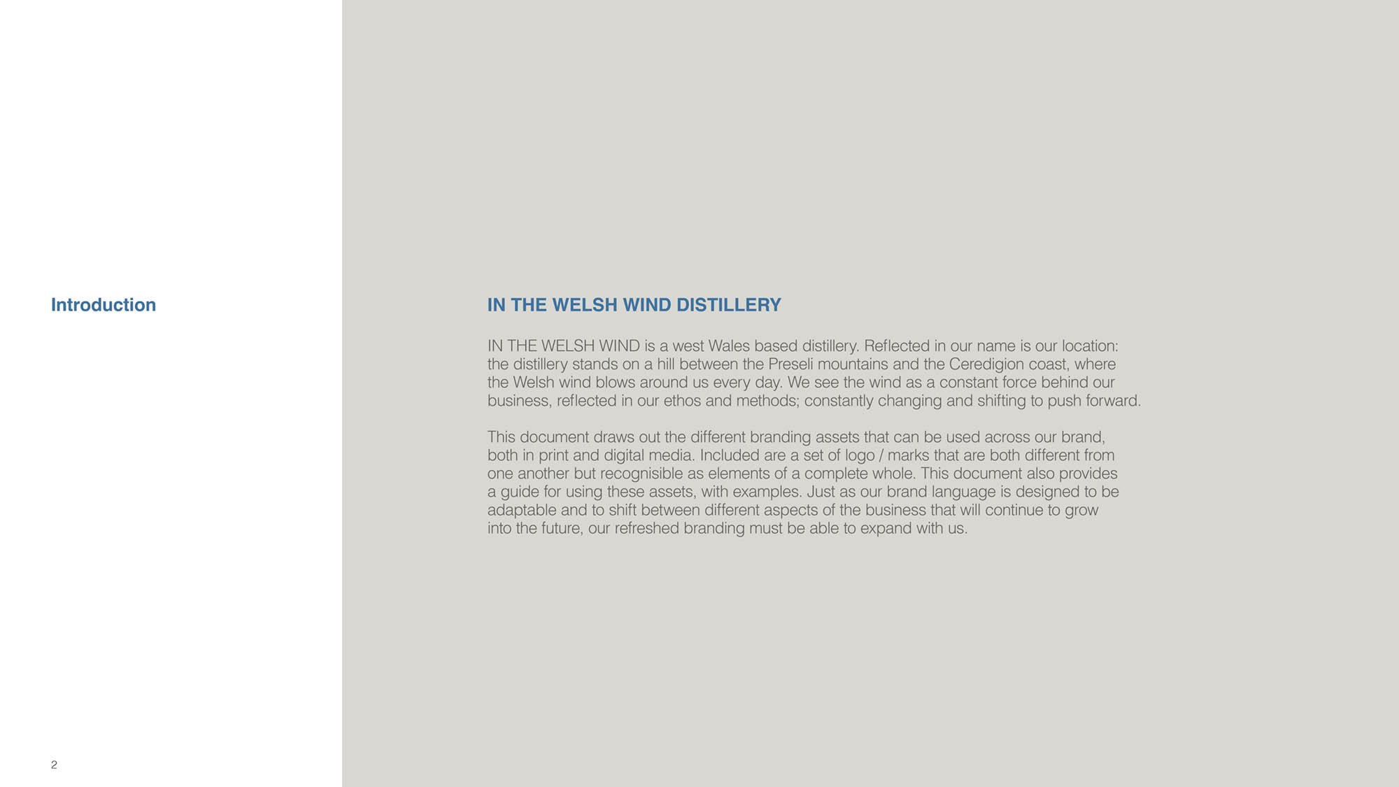
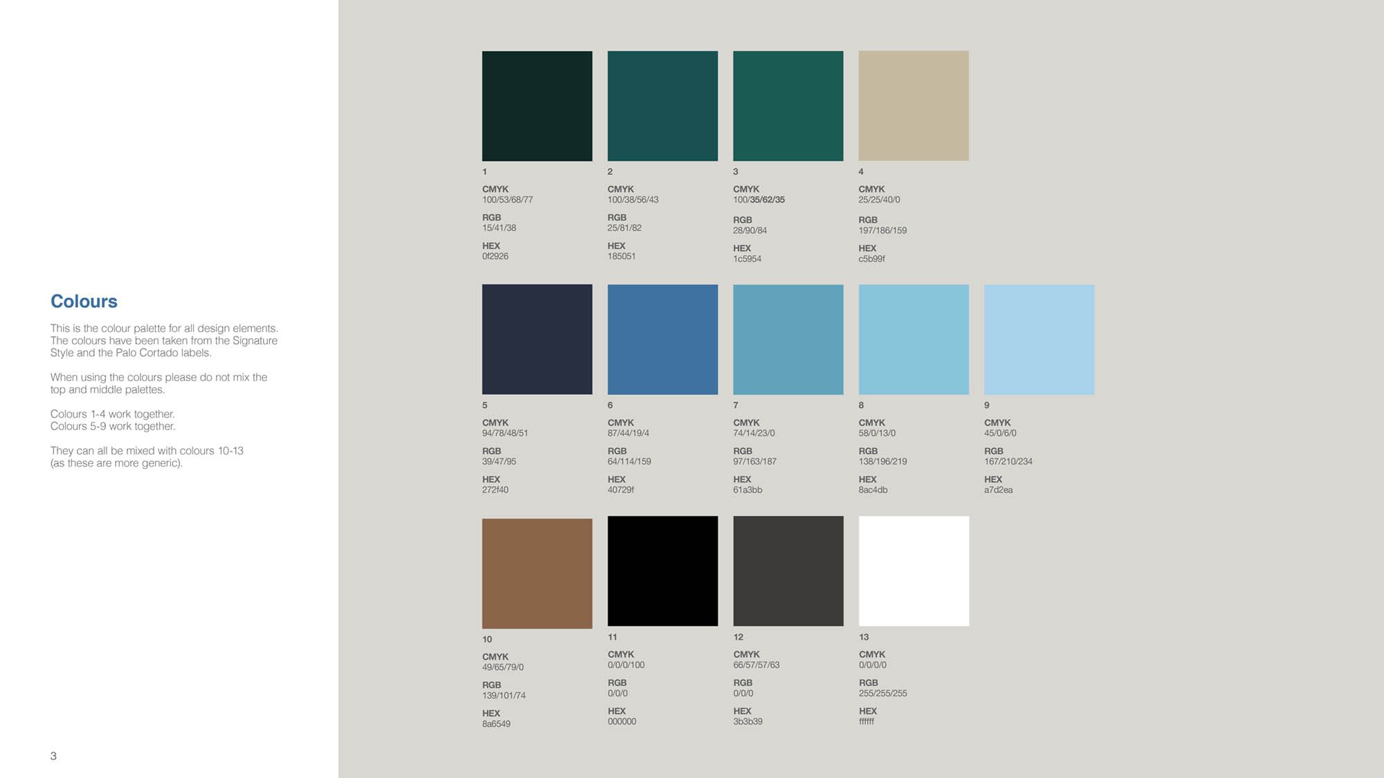
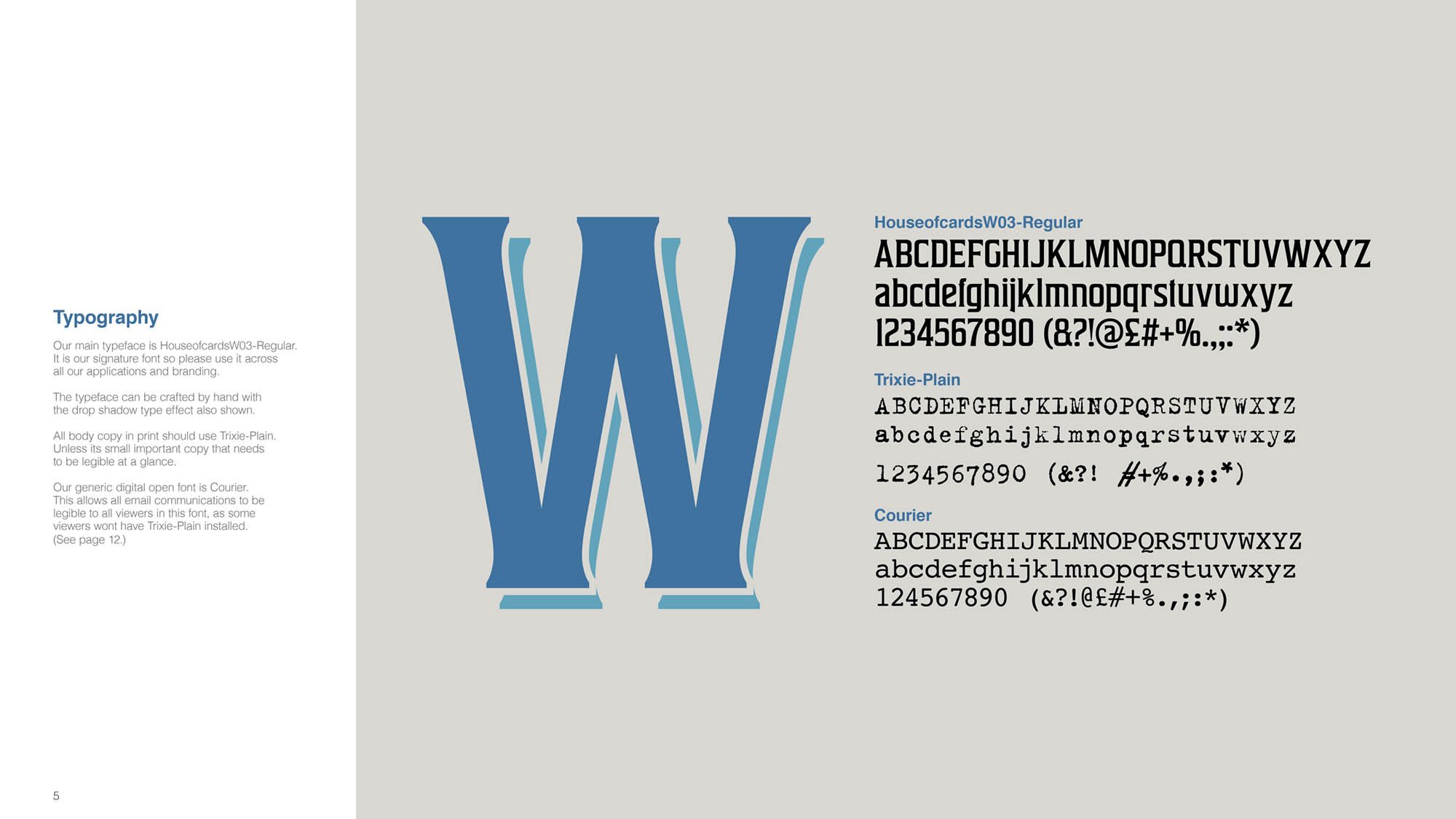
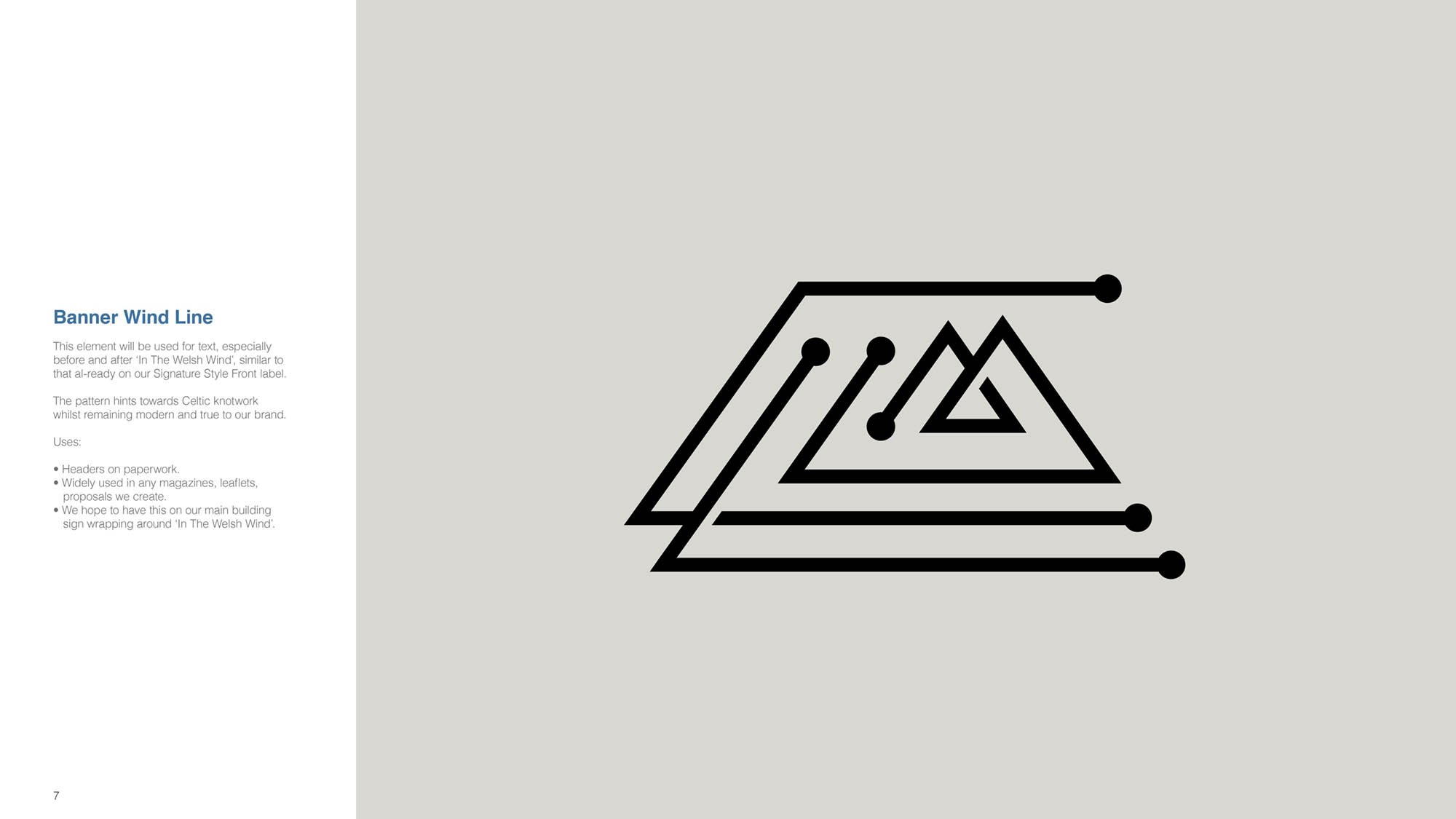
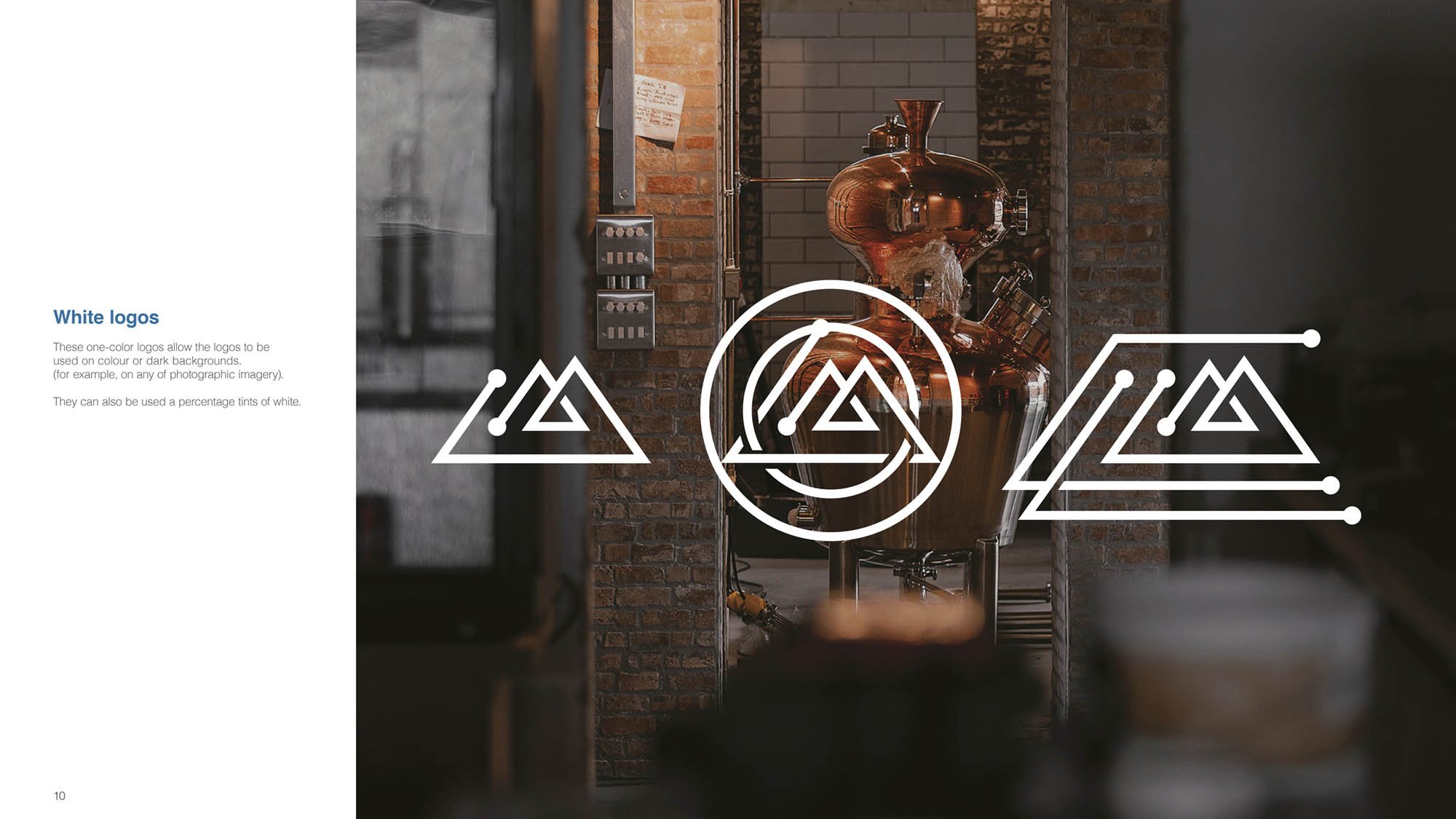
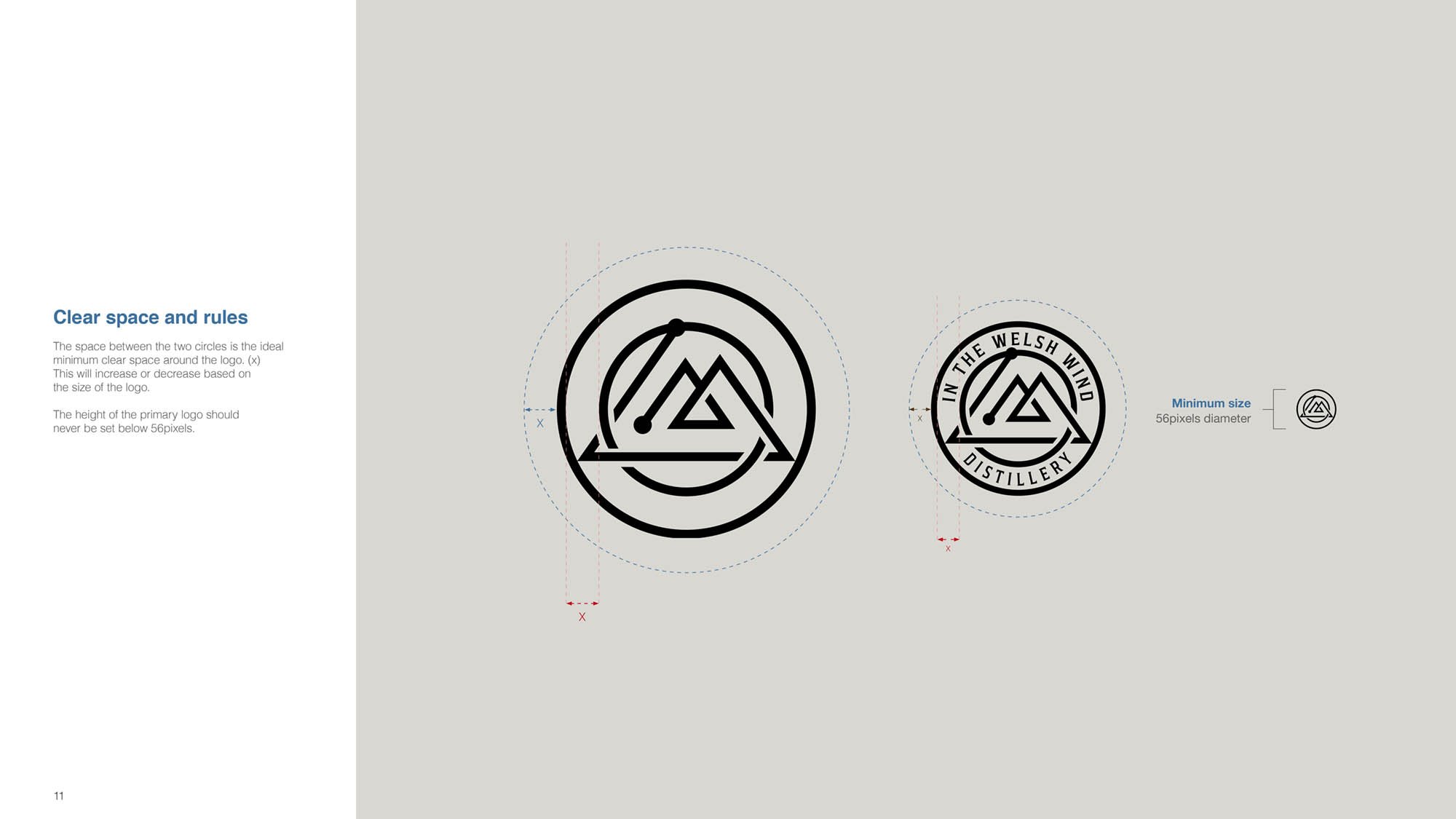
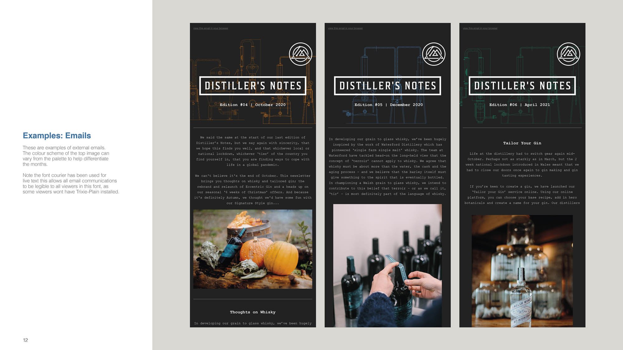
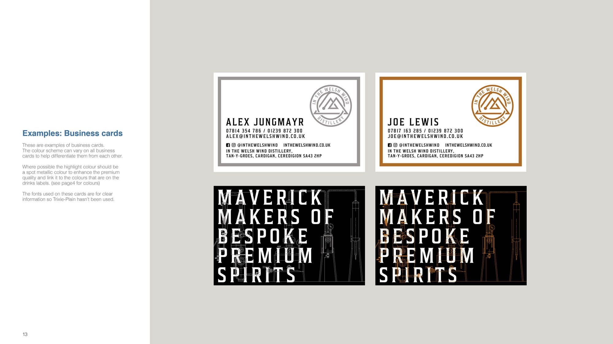
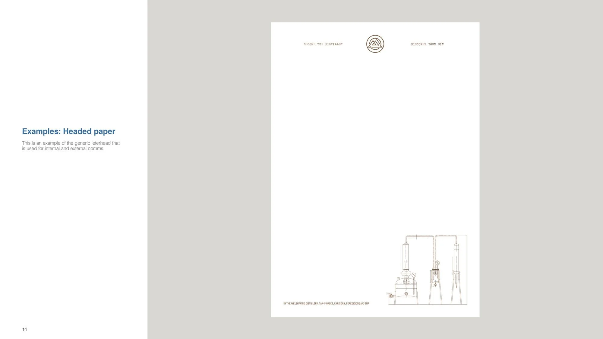
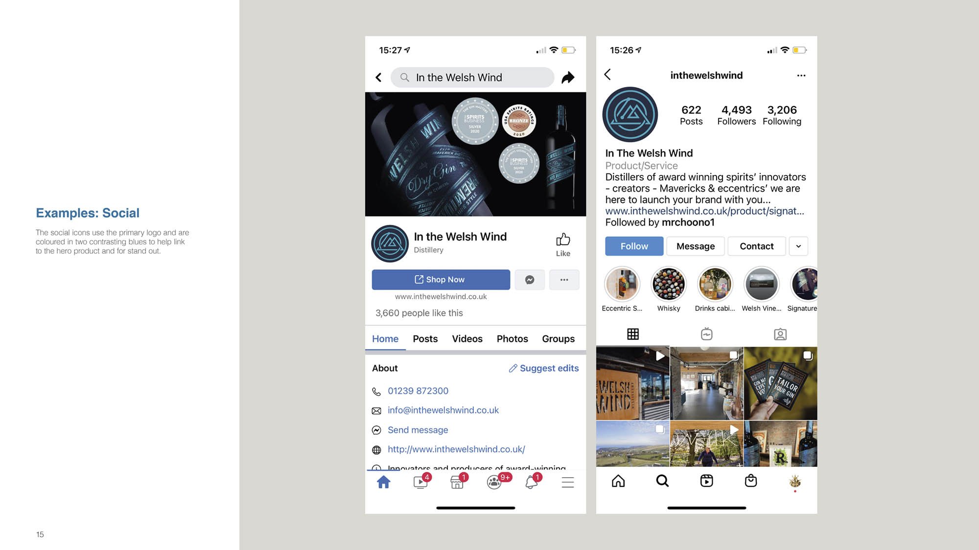
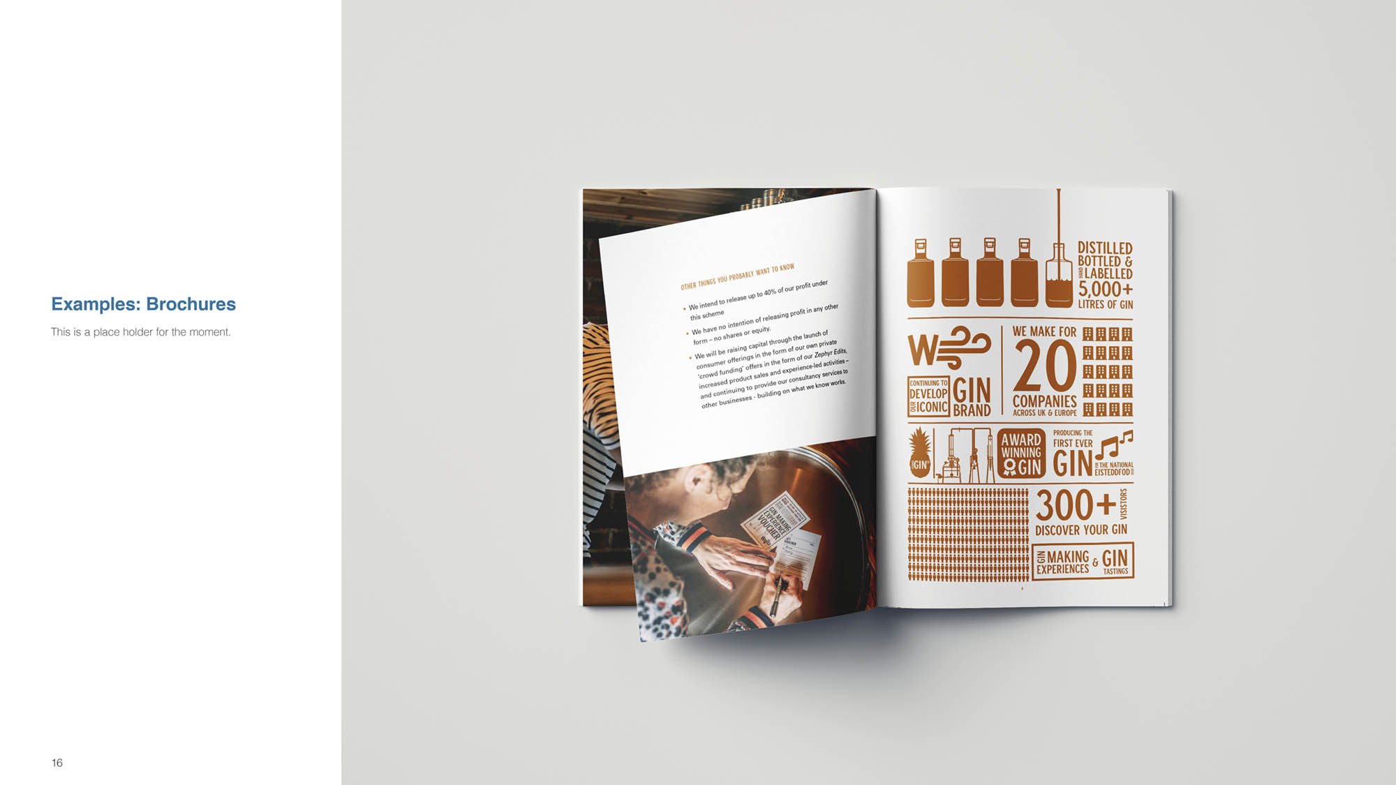
Using this concept as a starting point, I designed the new primary logo and created various versions suitable for merchandise. The new branding was then applied across a wide range of merchandise and all their key touchpoints.

WW copy.jpg
WINDOWLOGO copy.jpg
Artboard 2-100.jpg
Artboard 2 copy-100.jpg
TSHIRT_WW.jpg
Artboard 2 copy 2-100.jpg
INTHEWESHWIND_GUIDELINES_3.jpg
INTHEWESHWIND_GUIDELINES_39.jpg
INTHEWESHWIND_GUIDELINES_36.jpg
INTHEWESHWIND_GUIDELINES_32.jpg
INTHEWESHWIND_GUIDELINES_33.jpg
INTHEWESHWIND_GUIDELINES_35.jpg
INTHEWESHWIND_GUIDELINES_37.jpg
INTHEWESHWIND_GUIDELINES_38.jpg
INTHEWESHWIND_GUIDELINES_310.jpg
INTHEWESHWIND_GUIDELINES_311.jpg
INTHEWESHWIND_GUIDELINES_312.jpg
INTHEWESHWIND_GUIDELINES_313.jpg
INTHEWESHWIND_GUIDELINES_314.jpg
INTHEWESHWIND_GUIDELINES_315.jpg
INTHEWESHWIND_GUIDELINES_316.jpg
INTHEWESHWIND_GUIDELINES_317.jpg